M.1 (1) Which of the following statement is False?
There are two different interfaces in matplotlib. One is MATLAB(functional)-style interface, and the other is object-oriented interface.
The functional interface is stateless, while the object-oriented interface is stateful in matplotlib.
To generate a scatter plot in matplotlib, we can use either plot() or scatter() function.
To draw two figures in the same figure, we can call the plot() function twice.
Ans: Double click to answer the question
The functional interface is stateful.
M.2 (2) In the command plt.plot(x, y, '--sk'), what does the format string '--sk' mean?
Draw a dash line with black color and square marker.
Draw a solid line with black color and circle marker.
Draw a dotted line with sky blue color and square marker.
Draw a dash line with pink color and circle marker.
Ans: Double click to answer the question
M.3 (3) Which of the following statement is False?
Each axis in matplotlib contains both major and minor tick marks. As implied by their names, major ticks are generally more noticeable or sizable, while minor ticks tend to be smaller.
The keyword argument density=True in hist() function serves to normalize the histogram, enabling it to be shown on the same axes as the data.
By default, spines are situated at the edges of the axis and act as lines that connect axis tick marks, delineating the data area’s boundaries.
The primary benefit of using plot() instead of scatter() is the capability it offers to create scatter plots, allowing for individual customization of each point’s properties.
Ans: Double click to answer the question
scatter() instead of plot() enjoy the benifit of being more customizable.
M.4 (4) Which of the following grid will be returned by the command plt.subplots(3, 2)?
A grid with 3 columns and 2 rows and the first subplot is at the top left corner.
A grid with 3 rows and 2 columns and the first subplot is at the bottom left corner.
A grid with 3 rows and 2 columns and the first subplot is at the top left corner.
A grid with 3 columns and 2 rows and the first subplot is at the bottom left corner.
Ans: Double click to answer the question
M.5 (5) Which of the following command is used to show the plots directly within the notebook so that the plots can be embedded as static images in the notebook?
%matplotlib qt
%matplotlib inline
%matplotlib notebook
%matplotlib ipympl
Ans: Double click to answer the question
import matplotlib as mplimport matplotlib.pyplot as pltimport numpy as npplt.style.use('seaborn-whitegrid')
C:\Users\adm\AppData\Local\Temp\ipykernel_32440\1473361050.py:4: MatplotlibDeprecationWarning: The seaborn styles shipped by Matplotlib are deprecated since 3.6, as they no longer correspond to the styles shipped by seaborn. However, they will remain available as 'seaborn-v0_8-<style>'. Alternatively, directly use the seaborn API instead.
  plt.style.use('seaborn-whitegrid')
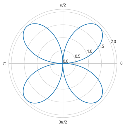
M.6 (6) Try to plot the rose curve \(r=a\times \sin(n\theta)\) with \(a=2\) and \(n=2\) which means the curve has 4 petals as follows:
# The rose curve:t = np.linspace(0, 2*np.pi, 1000)r =2*np.sin(2*t)# plot in polar coordinatesplt.axes(projection='polar')plt.plot(t+(r<0)*np.pi, np.abs(r), '-')# Set ticks for polar coordinateplt.xticks([0, np.pi/2, np.pi, 3*np.pi/2], ['0', '$\pi/2$', '$\pi$', '$3\pi/2$']);plt.yticks([0, 0.5, 1, 1.5, 2]);
Note that you should change the ticks according to the above plot and you can use the trick mentioned in our slides to set the radius of 0 to the origin.
# Your code here
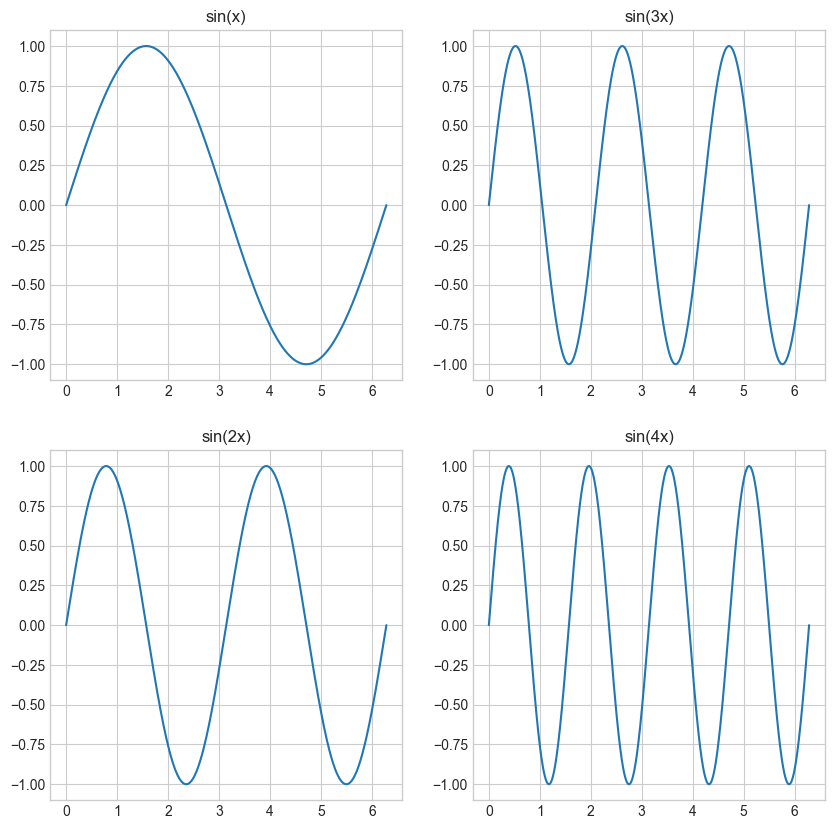
M.7 (7) Try to plot \(\sin(x)\), \(\sin(2x)\), \(\sin(3x)\), \(\sin(4x)\), in different subplots in the same figure organized as follows:
# Sine Functions with Different Frequencies:x = np.linspace(0, 2* np.pi, 1000)# Calculate the sine functionsy1 = np.sin(x)y2 = np.sin(2* x)y3 = np.sin(3* x)y4 = np.sin(4* x)# Create the figure and subplotsfig, axs = plt.subplots(2, 2, figsize=(10, 10))# Plot the sine functions in the subplotsaxs[0, 0].plot(x, y1)axs[0, 0].set_title('sin(x)')axs[1, 0].plot(x, y2)axs[1, 0].set_title('sin(2x)')axs[0, 1].plot(x, y3)axs[0, 1].set_title('sin(3x)')axs[1, 1].plot(x, y4)axs[1, 1].set_title('sin(4x)');
Remember to add the title to your plot using set_title() function.
# Your code here
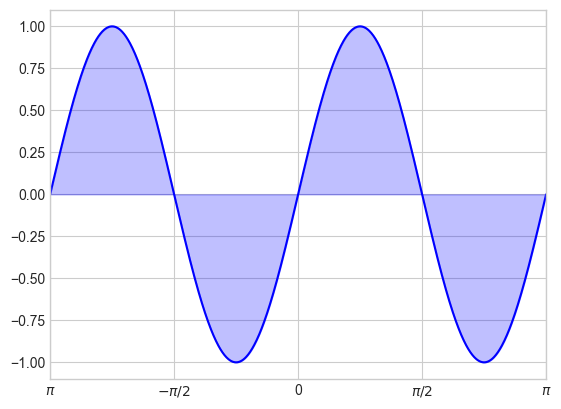
M.8 (8) Try to plot the \(\sin(2x)\) function in the range \(x = [-\pi, \pi]\) and fill the area between the curve and the x-axis with the color blue and alpha=0.25 as follows:
# Example plot:n =1000X = np.linspace(-np.pi, np.pi, n)Y = np.sin(2* X)#plt.axes([0.025, 0.025, 0.95, 0.95])plt.plot(X, Y, color='blue', alpha=1.00)plt.fill_between(X, 0, Y, color='blue', alpha=.25)plt.xlim(-np.pi, np.pi)#plt.ylim(-2.5, 2.5)radian_multiples = [-1, -1/2, 0, 1/2, 1]radians = [n * np.pi for n in radian_multiples]radian_labels = ['$\pi$', '$-\pi/2$', '0', '$\pi/2$', '$\pi$']plt.xticks(radians, radian_labels);
You can use the following code to set the ticks:
radian_multiples = [-1, -1/2, 0, 1/2, 1]radians = [n * np.pi for n in radian_multiples]radian_labels = ['$\pi$', '$-\pi/2$', '0', '$\pi/2$', '$\pi$']plt.xticks(radians, radian_labels);
# Your code here
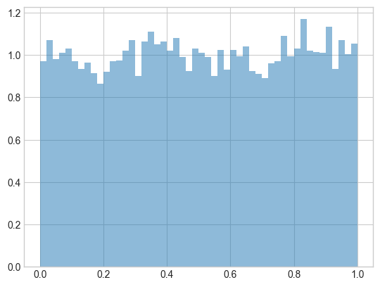
M.9 (9) Use np.random.rand() to generate 10000 data points and plot the histogram of the data points with 50 bins and normalize it so that the area under the histogram integrates to 1. Check out the documentation of np.random.rand() on the official website. Does the plot look like the distribution mentioned on the official website?
data = np.random.rand(10000)plt.hist(data, bins=50, density=True, alpha=0.5);
Yes, it looks like the data are random samples from a uniform distribution over [0, 1).
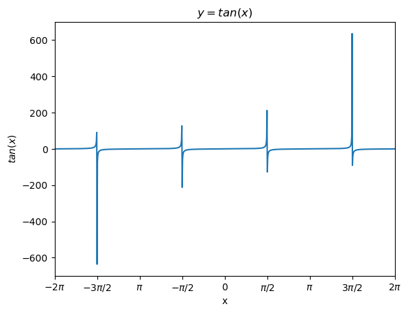
M.10 (10) When we try to plot \(tan(x)\) using plot() function and set the limit of x between \([-2\pi, 2\pi]\), we will get the following figure: